Design should solve a problem, not just be visually appealing. Therefore, I need a problem to solve — parameters within which to design.
One of our clients, Kensington Video, was starting from the ground up with an entire rebranding for their store reopening.
We knew the physical store was going to be completely redone with a Casa Blanca-themed look.

Casa Blanca was released in 1942. Ken Video is an icon within the San Diego neighborhood of Kensington, and many of downtown Kensington’s commercial spaces were constructed around the same era.
Kensington Video wasn’t really around until the 1980s, and the original store that housed it wasn’t around until the 1960s. But if you don’t count its brief close in 2015, it’s still one of the oldest currently operating stores in the neighborhood.
Setting the store’s own history aside, we decided to run with the 1940s era as our parameter to design within. We had to think about typography, iconography, and color. For the purpose of this post, we’ll just focus on the color aspect of the design.
Since Kensington Video is very film-focused, we set our sights on film and art from the 1940s era to lend inspiration.
There was a lot going on culturally in the American 1940s, and WWII was at the center of it all.
In the first half of the decade, as America was emerging from the Great Depression and entering WWII, things were dark.

Edward Hopper’s art and film noir reflected this dark side of current affairs.


Walt Disney’s film creations were coming to prominence at the time and were both a reflection and reaction to the darkness — bringing magic, mystery, and happy endings to an otherwise depressed country.

Drawing from these sources as inspiration, the following color palette was developed:

Red: A cautionary hue inspired by film noir movie posters.
Yellow: A subdued, almost melancholy amber hue inspired by Edward Hopper’s Gas and Disney’s Fantasia.
Teal: A subdued, yet friendly hue inspired by Disney’s Fantasia and Edward Hopper’s Nighthawks.
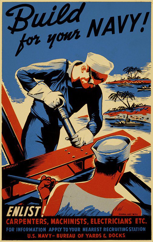
Blue: A moody hue inspired by military uniforms and propaganda posters as well as Edward Hopper’s Nighthawks.
Purple: A moody, yet happy hue inspired by Disney’s Fantasia.
When developing color palettes, I typically try to stick to the basics of including colors reminiscent of red, orange, yellow, green, blue, and purple. In this palette, orange and yellow are combined to one hue, and teal takes the place of green.
The particular hues chosen embody the sophistication of the Kensington neighborhood and, subsequently, the Ken Video customers. Though the palette is inspired by a bygone era, these colors still have a contemporary feel that will work well for Kensington Video as they step into a new, high-tech era for their company.
Kensington Video will be reopening in Fall 2015 with a new website and digital movie database we’re working on creating for them. Stay tuned for updates!
Resource: PANTONE The 20th Century in Color

