

In the U.S., 50% of all cell phones are smartphones. Yet even with half the market accessing the web from a cell phone, mobile optimized sites are not as frequent as you might think. There are still even more sites that are not only not mobile optimized, but are completely unusable on a mobile device.
Learn from these 11 examples websites that are leading the not-so-new mobile revolution. We’ll look at what they did right and some areas they can improve upon.
#1: Sony

Sony does a great job of making it easy to find what you’re looking for quickly from the home screen. They have a simple list menu to choose what category you’re interested in and each one goes further into specific products until you’ve reached the one you’re looking for. Unfortunately, once you find the specific product you’re looking for and select it, you’re redirected to a website that is not optimized for a mobile device and things get very hard to read and select.
Sony’s home screen does a great job qualifying visitors and directing them to where they want to go, but once they get there, they will probably have a difficult time keeping them there and actually converting them. It’s a good start, but a weak finish.
#2: Zappos

Looking for shoes? Zappos makes it a walk in the park to browse and purchase your next pair of kicks.
The mobile site includes a search bar at the top of the page and at the bottom in case you can’t find what you’re looking for in the middle. Like Sony, Zappos does a great job directing visitors to the area they’re looking for with easy-to-use drop down menus. The entire search, selection and purchase process is simple and easy to navigate. You can even share what you’re looking at directly from the app via Facebook, Twitter or email.
The Zappos mobile website is great example for eCommerce websites to study.
#3: Etsy


Etsy’s mobile site has simple navigation and a search bar right at the top. You can elect to search by category as well. The buttons and drop down menus leave plenty of finger room for easy selection. Once you find what you’re looking for, it’s a snap to add it to your cart. Similar to most full sites, the cart is located in the top navigation to see what’s in there quickly. Plus, you can easily check your sales or orders on the mobile site. A non-distracting reminder to try their native app is a nice touch.
#4: iAwriter
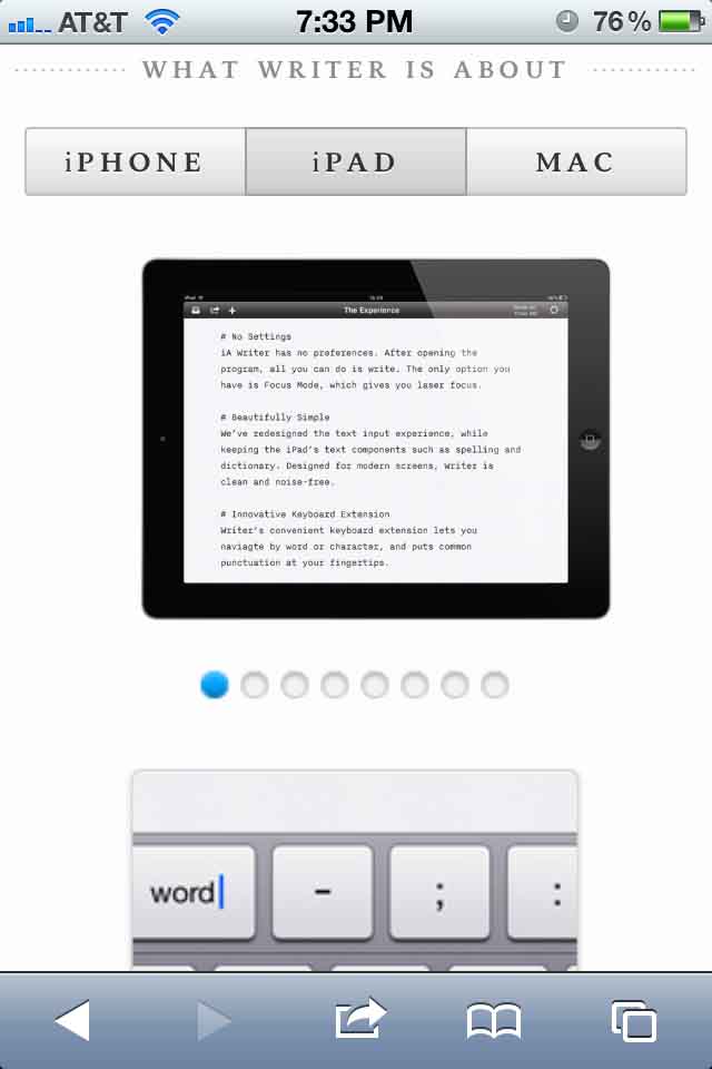
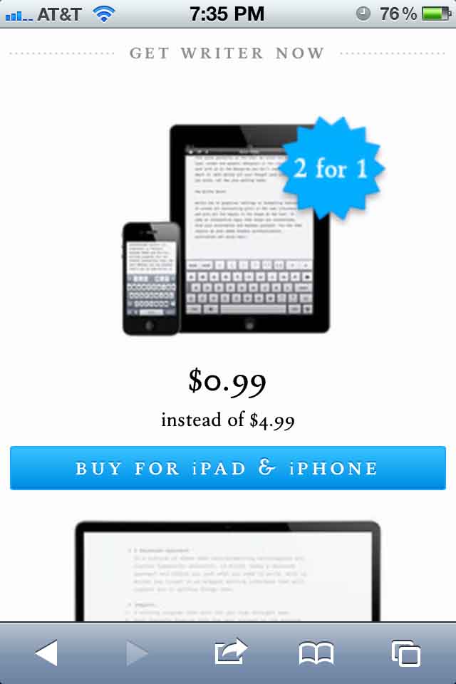
Clean, beautiful, readable and functional. Just like the app itself. iA Writer’s mobile site is simply an advertisement for their app. They have an explanatory video right at the top of the app to tell you what iA Writer is. After scrolling through marketing copy which explains in more detail the benefits of using the app, you’re finally presented with the option to buy it.
The site is perfectly functional on a mobile device, but could probably improve it’s conversion rate by duplicating the “buy” button somewhere toward the top of the page. Making the user scroll so far down through all your marketing copy isn’t the best user experience. If they want to know more they’ll keep scrolling. If they want to buy it, let them!
#5: Panera Bread


Panera leads the fast/casual dining market with the best mobile site in their segment. If you’re going to a restaurant’s website you’re probably looking for one of two things, directions or a menu. Those are the two options you’re presented with on Panera’s mobile site.
The buttons and drop down menus are very large and easy to select, getting you to exactly what you’re looking for quickly. The location button uses your phone’s GPS to determine where the closest location is to you without having to type in your zip code.
#6: Mail Chimp


Big buttons and clear calls to action make Mail Chimp’s mobile site a joy to use. The home screen acts as a funnel for signing up, logging in, getting pricing or looking at features. The list navigation with corresponding icons is easy to use and connects the branding throughout all the pages. Again, a sign up button would be great to have in more places that at the very bottom of a long scroll list. Perhaps a sticky-header could be a solution rather than breaking the list?
#7: Zurb


These guys make mobile sites for a living, so it’s no wonder their own site is a fully responsive design. They give a quick intro to who they are at the top and then funnel you into three options, design strategy, interaction design, and interface design. Their “more about us” type content is located after you have the chance to tell them what you’re interested in.
#8: Food Network


Not as pretty as some of their signature dishes, but it’s functional. You can find recipes in a snap through their search field or by category.
#9: Above & Beyond

This DJ trio knows how to make a website that just works on a mobile device. The site features clear links to useful features like tickets and sample tracks. Since their site requires a bit of scrolling, their header is a sticky header and floats at the top as you scroll behind it.
This is a great idea for sites that require a lot of scrolling. Unfortunately, their header is gigantic and takes up one-third of my viewing area. Great idea, poor execution.
#10: ESPN
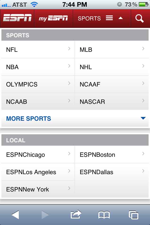


One of the best mobile sites out there, it’s just as useful as the full/non-mobile version. There is so much content on the website, but it is organized so intuitively. You can easily read the headlines or get straight to the sport you’re interested in with their easy-to-use navigation.
#11: Flickr


Flickr’s mobile site provides a simple way to browse pics while on the go. It’s easy to sign in, browse, post and comment on photos.
Simple, easy to use navigation and buttons are the most important component of mobile site design. Buttons that are too small to tap will frustrate your user. Always design for someone with bad eyes and large finger tips – make those buttons big!
The bottom line – no matter who your target audience is, be sure your website functions on a mobile device.
Know of other great mobile websites? Leave them in the comments -we’d love to hear about them!